Data visualization is gaining popularity with each passing year. This art and science of presenting complex information and data in a graphical or visual format, is helping businesses share data-driven insights for a visually appealing experience. It involves creating visual representations of data to help people better understand and interpret the information displayed. Displaying data in a visual format, patterns, trends, and relationships, help quickly identify it, and allow conclusions to be drawn that may not have been apparent otherwise.
Effective it refers to a critical tool that helps with decision-making, analysts, and anyone who wishes to communicate complex information to others. In this blog, we shall find out some amazing aspects of data visualization, including the use of data dashboards, and how you can implement it to accelerate your business growth from various peripherals.
So, without further ado, let’s get started!
Table of Contents
Brief History of Data Visualization
It has a long and rich history dating back to ancient times. One of the earliest data visualization dashboard examples is the use of pictographs, which were used by ancient civilizations such as the Egyptians, Babylonians, and Incas to record data on everything from food supplies to astronomical events.
In the modern era, the field of data visualization began to take shape in the 18th and 19th centuries, with the development of techniques such as statistical charts and graphs. One of the pioneers of this field was William Playfair, a Scottish engineer who developed the line chart, bar chart, and pie chart in the late 18th century.
In the 20th century, the advent of computer technology enabled the creation of more sophisticated and complex visualizations. In the 1960s, the field of computer graphics began to emerge, and researchers developed new techniques such as vector graphics, which enabled the creation of high-quality, scalable images.
Today, it is a rapidly growing field, driven by advances in computer technology and the increasing availability of large, complex data sets. From interactive dashboards to 3D visualizations, it is an essential tool for analysts, researchers, and decision-makers across a wide range of industries and disciplines.
Let’s dive deeper into what is Data visualization and Analytics and how you can leverage it for business growth.
What Data Visualization & Analytics Mean for Businesses?
Data visualization and Analytics are two closely related concepts that are often used together to gain insights from data.
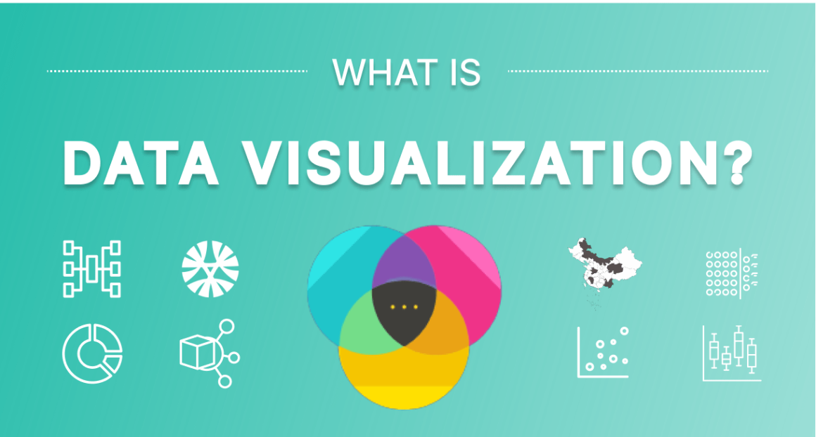
It refers to the process of creating visual representations of data to help people better understand and interpret the information presented. By displaying data in a visual format, patterns, trends, and relationships can be quickly and easily identified, allowing for insights and conclusions to be drawn that may not have been apparent otherwise. A few examples of it include charts, graphs, maps, and other graphical representations of data.
Want to Leverage Data Visualization & Analytics?
Our experts help you turn raw data into actionable insights with powerful visualization and analytics tools for smarter business decisions.
Data analytics, on the other hand, refers to the process of examining large data sets to uncover patterns, trends, and insights that can be used to inform decision-making. Data analytics involves a range of techniques and methods, including statistical analysis, data mining, machine learning, and predictive modelling, among others.
In the business world, data visualization and analytics are often used together to help people understand and make sense of large and complex data sets. It helps to make patterns and trends more visible, while data analytics can help to uncover the underlying causes, business challenges, and relationships that drive those patterns and trends. Together, these two approaches can provide powerful tools for understanding and leveraging data to drive business and other types of decision-making.
What Are the Various Types of Data Visualization?
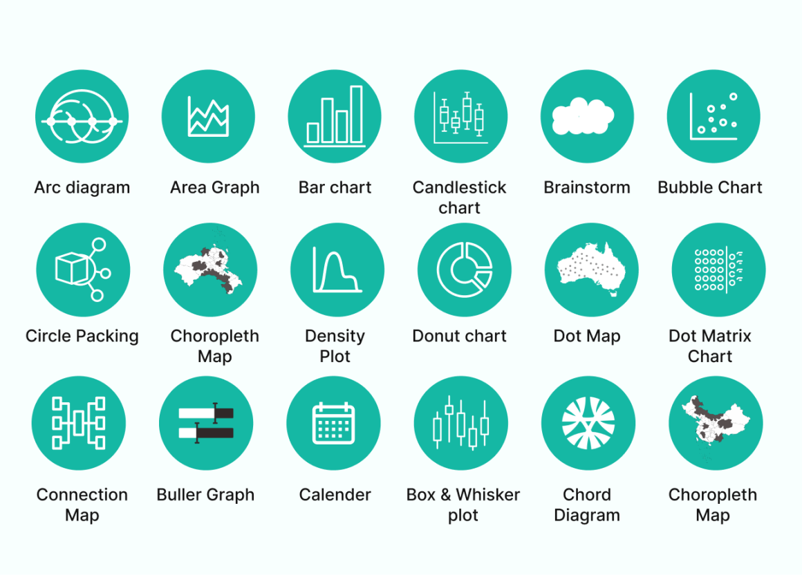
There is a wide array of data visualization tools, and the choice of visualization depends on the type of data, the insights you want to gain, and the audience you are trying to communicate with. Here are some of the most common types of data visualization:
- Bar Charts: These charts help to compare discrete categories of data, typically represented as rectangular bars.
- Line Charts: It helps track changes over time, with data points connected by a line.
- Pie Charts: These are used to show how a whole is divided into parts, with each part represented as a slice of the pie.
- Scatter Plots: It helps to show the relationship between two variables, with each data point represented as a dot.
- Heat Maps: These maps are used to show the distribution of values across a two-dimensional area, typically represented by color.
- Tree Maps: It helps to show hierarchical data, with the size of each rectangle representing a different value.
- Network Graphs: These graphs help to show relationships between nodes, typically represented as circles, with lines connecting the nodes to show the connections.
- Geographic Maps: These maps are used to show data in a geographic context, typically using colors or symbols to represent data points on a map.
These are just a few examples of the many types of data visualization available today in the business world. However, the key is to choose the visualization that best represents the data and insights that you want to communicate, while also considering the preferences and needs of your target audience.
Therefore, consult with the best professionals in town who can guide you with their hands-on experience with data visualization solutions, and mark your data in a visually appealing manner for your audience to connect with your brand seamlessly.
Is Data Visualization a Wise Investment in the Future of Big Data?
Yes, it is a wise investment in the future of big data. How? Let’s find out.
With the increasing amount of data being generated every day, it is becoming more and more challenging to make sense of this data and gain actionable insights. These tools provides a powerful platform for transforming complex data sets into intuitive, visual representations that can be easily understood and acted upon.
Effective it enables decision-makers to quickly identify patterns, trends, and relationships in large and complex data sets, making it easier to uncover insights and drive informed decision-making. By investing in data visualization tools and techniques, organizations can better leverage the power of big data and gain a competitive advantage in their industries.
Furthermore, with the rapid advancements in data visualization technologies and techniques, the potential for leveraging big data is only going to increase in the future. As more and more organizations adopt data-driven decision-making, it will become an increasingly essential tool for understanding and acting on the insights provided by big data.
Hence, it is a wise investment in the future of big data, as it provides a powerful tool for transforming complex data sets into intuitive, visual representations that can be easily understood and acted upon.
What Is the Significance of Data Visualization?
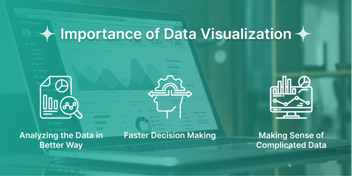
It is significant because it helps people make sense of large, complex data sets, facilitates informed decision-making, enhances communication, increases efficiency, and promotes innovation. Some of the significant benefits are listed below:
- Helps in understanding complex data: It provides a way to understand large, complex data sets by transforming them into visual representations, such as graphs, charts, or maps. These visualizations allow people to identify patterns and relationships that might not be apparent from raw data.
- Facilitates decision-making: With visualizations, it gets easier for decision-makers to see trends and patterns, helping them to make informed decisions based on data-driven insights.
- Enhances communication: It enable people to communicate complex data to others more effectively. By presenting data in a visual format, people can easily convey information to others who may not be familiar with the details of the data.
- Increases efficiency: By making it easier to understand and interpret data, it can save time and increase efficiency. Business decision-makers can quickly identify relevant information and take their decisions faster than they could by poring over spreadsheets or other data formats.
- Promotes innovation: Above all, visualizing data can help uncover new insights and connections, which can lead to innovative solutions and new opportunities for growth.
What Is the Process of Data Visualization?
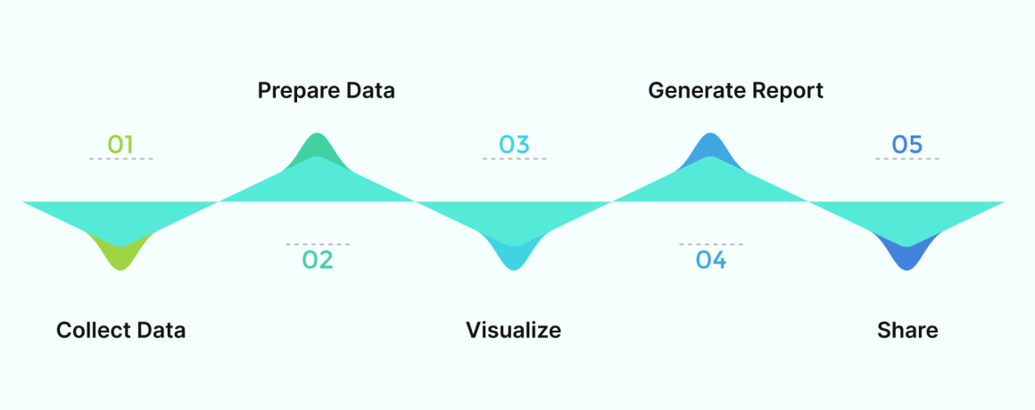
If you’re wondering how to get started with it, and how you can get benefit from it, here is a quick work process to navigate the starting point. However, to avoid all the hassles, you can opt to hire data analysts from a trusted, and well-renowned organization like ours.
Here is the work process, which typically involves the following steps:
Identifying the objective:
Determine the purpose of the visualization and what you want to communicate to the audience. Is it to show trends, patterns, or comparisons?
Data collection and data cleaning:
Collect relevant data from various sources and clean it to remove any errors, inconsistencies, or missing values. This step is important to ensure that the visualization accurately represents the data.
Choose the right visualization tool:
Select a visualization tool or software that can best represent the data based on the objective and the type of data you have. There are many types of visualization tools available, such as charts, graphs, maps, and dashboards.
Choose the right chart type:
Choose the chart type that best represents the data and supports the objective. For example, if you want to show a comparison of values, a bar chart may be more appropriate than a line chart.
Design the visualization:
Once you have chosen the visualization tool and chart type, design the visualization. It involves selecting the color scheme, font, and other design elements to make the visualization aesthetically pleasing and easy to understand.
Test and refine the visualization:
Test the visualization with a small audience to ensure that it effectively communicates the objective and is easy to understand. Adjust as needed.
Publish and share the visualization:
Publish the visualization in a format that can be easily shared with the target audience, such as a report, webpage, or presentation.
What Are the Techniques Involved in Data Visualization?
The choice of technique depends on the type of data, the objective of the visualization, and the audience for whom the visualization is intended. However, there are several techniques involved, which you can choose depending on your data type:
- Charts and graphs: Charts and graphs are commonly used to visualize data. They include bar charts, line graphs, scatter plots, pie charts, and many others. These visualizations help to show trends, patterns, and comparisons in the data.
- Heatmaps: These maps are used to show the distribution of values across a large dataset. They use color coding to indicate the intensity of a value.
- Maps: It helps to visualize data geographically. They show the spatial distribution of data and can be used to compare data across regions or countries.
- Infographics: They are a combination of text and images. They are used to convey complex information in a visually appealing way.
- Tree diagrams: These diagrams are used to show hierarchical relationships between data points. They are commonly used in organizational charts and family trees.
- Sankey diagrams: It helps to visualize the flow and show the movement of data between different points. They are commonly used in energy and material flow analysis.
- Interactive visualizations: It allows users to explore data by interacting with the visualization. They can be used to zoom in and out of data, filter data, and highlight specific data points.
What are the Advantages and Disadvantages?
Advantages:
- Clarity and simplicity: It provides a clear and concise way to represent complex data. It simplifies the data and makes it easier to understand.
- Identification of patterns and trends: They helps in identifying patterns and trends that may not be apparent from raw data. It provides insights that can help in making better decisions.
- Better communication: Visual representations of data are easier to understand and communicate to others. This can help in conveying information to stakeholders and decision-makers in a more effective way.
- Exploration of data: Allow users to explore data and uncover insights that may not be immediately apparent.
- Increased efficiency: It allows for faster data analysis and decision-making. It saves time and resources by presenting information in a more accessible and understandable way.
Disadvantages:
- Misrepresentation of data: It can be misleading if the designer is not careful. The use of inappropriate charts or manipulation of data can lead to misinterpretation of the data.
- Over-simplification of complex data: It may oversimplify complex data, leading to a loss of detail and nuance. This can result in a lack of understanding of the true complexity of the data.
- Biased representation: They can be biased based on the designer’s preferences and assumptions. This can lead to a biased representation of the data.
- Limited by technology: Some tools may have limitations in terms of the types of data they can handle or the complexity of the visualization.
- Limited interpretation: It can only show what is in the data and cannot provide explanations or interpretations of the data. It is up to the user to interpret and analyze the data.
What Are the Best Practices for Data Visualization and Data Analytics?
Still, wondering how data visualization and big data are the future of the data-driven world? Here are some best practices to help you leverage its full potential:
- Identify your audience: Understanding your audience and their needs is essential when designing data visualizations. Consider their level of expertise and what they are trying to achieve.
- Keep it simple: Use clear and concise visualizations that are easy to understand. Avoid clutter and unnecessary complexity.
- Choose the right visualization type: Select the appropriate visualization type that best represents the data and supports the objective. Different visualization types work better for different types of data.
- Use color effectively: Use color to highlight important information and create contrast, but avoid using too many colors, which can be confusing.
- Label axes and provide context: Ensure that axes are labeled clearly and provide context for the data. Include units of measurement and explanations of any acronyms or terms.
- Tell a story: Use data visualization to tell a story and convey a message. Start with an overview and then delve into the details.
- Keep data accurate: Ensure that the data used in visualizations is accurate and up to date. This can be achieved through proper data cleaning and verification.
- Analyze the data: Use data analytics to identify patterns, trends, and insights that can inform decision-making. This can be done through exploratory data analysis, statistical modeling, and machine learning.
- Test and refine: Test the visualization and analytics with a small audience to ensure that they are effective in communicating the intended message. Refine as needed based on feedback.
- Use appropriate technology: Select appropriate technology and tools for data visualization and analytics. This can include software for data cleaning, statistical analysis, and visualization. Keep up with new developments in technology and best practices to stay current.
Data visualization and Big Data
It is a powerful tool for working with Big Data. As the name suggests, Big Data refers to datasets that are so large and complex that they cannot be easily processed using traditional data processing methods.
Therefore, it can help in making sense of Big Data by presenting it in a clear and concise manner. It allows users to explore large datasets and identify patterns and trends that may not be immediately apparent from the raw data. Also, these tools can help in visualizing Big Data in real time, making it easier to identify trends and anomalies as they occur.
However, one of the challenges of working with Big Data is that it can be difficult to manage and analyze it due to its size and complexity. After all, they can help in simplifying the data and making it more accessible, allowing users to quickly identify insights and make informed decisions.
In addition, other techniques such as machine learning and artificial intelligence are commonly used to analyze Big Data. These techniques help with identifying patterns, making predictions, and automating decision-making processes.
Above all, It is an essential tool for working with Big Data. It allows users to explore large datasets and identify insights that can inform decision-making. Therefore, it is important to choose the right visualization techniques and tools that are best suited to the specific needs of the data and the intended audience.
Wrapping Up
So far, It is a powerful tool used in collaboration with Big Data, which refers to datasets that are large and complex. It allows users to explore large datasets and identify patterns and trends that may not be immediately apparent from the raw data. Thus, it simplifies the data and makes it highly accessible, allowing users to quickly identify insights, and make informed decisions.
Other techniques like machine learning and artificial intelligence are also commonly used to analyze Big Data. Therefore, It becomes a highly essential tool for working with Big Data, and if you haven’t started with it, now is the right time. Choose the right visualization techniques and tools that are best suited to the specific needs of the data and your intended audience.
For more insights on big data, data visualization and analytics, connect with our experts, and they shall guide you with the best service offerings.
FAQs
1- What Is Data Visualization?
Typically, it refers to the representation of data through visual and graphical means, allowing for a better understanding and interpretation of complex information.
2- What Is Big Data?
Big data refers to datasets that are so large and complex that they cannot be easily processed using traditional data processing methods. It typically includes datasets that are too large to be stored on a single computer or analyzed using traditional software.
3- What Is the Importance of Data Visualization in Big Data?
When it comes to the importance of it is important in big data because it allows users to explore large datasets and identify patterns and trends that may not be immediately apparent from the raw data. It simplifies the data and makes it more accessible, allowing users to quickly identify insights, and make informed decisions.
4- What Are the Common Techniques Used for Data Visualization in Big Data?
Some of the common techniques used for data visualization in big data include scatter plots, bar charts, line graphs, heat maps, and geographic maps. Other techniques such as machine learning and artificial intelligence are also commonly used to analyze Big Data.
5- What Are the Challenges of Working With Big Data?
The challenges of working with big data include managing and processing large and complex datasets, ensuring data accuracy and reliability, and identifying relevant insights and patterns from the data.
6- How Can Machine Learning and Artificial Intelligence Help With Big Data Analysis?
Machine learning and artificial intelligence can help with big data analysis by automating the process of identifying patterns and trends in large datasets, making predictions, and informing decision-making processes.
7- What Are the Best Practices for Data Visualization in Big Data?
Some of the best practices for data visualization in big data include identifying your audience, keeping it simple, choosing the right visualization type, using color effectively, labeling axes and providing context, telling a story, keeping data accurate, analyzing the data, testing, and refining, and using appropriate technology.